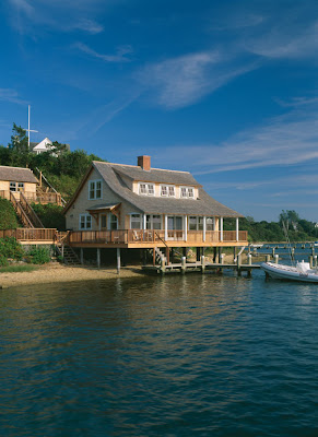
 Some of my most favorite spaces are smaller ones. And this recent renovation by Hutker Architects in Martha's Vineyard is no exception.
 Formerly a boat house, the 1,100 square foot renovation opened up the space and provided a wonderful ocean escape for the family. Built right over the water, it's almost as if you are on a boat.
 Upon entering the neutral decor lets the water views take center stage. You will notice that the trim, walls and ceiling are all painted the same color. This is an old decorating trick. If the trim was a painted a whiter shade than the walls your eye would stop (even for the briefest second) at each opening. By keeping the color uniform your eye stops only when it sees the view or into the next room. I find this trick really opens up a room.
The family room has plenty of seating and the ottoman coffee table is a wonderful addition which adds a nice textural element and a few extra seats. Again a neutral sofa is key and the pillows add the dash of color. Notice the beamed ceiling and beadboard above.
 This kitchen is perfect! It has all the amenities you need in a carefully designed space. Green soapstone and rattan stools compliment the family room decor. I really like the different rugs. Not matching the rugs, but choosing complimentary colors adds another layer of interest.
 Who would guess that this small area could seat 8 adults? A good trick in a limited area is to add a banquette. I am sure you can even fit more if they were children! Pale blue dominates this area, but notice it compliments the ocean and because it is so subtle it does not compete with the view.
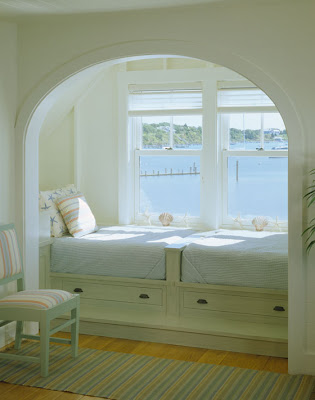
  Every ocean retreat needs a hideaway spot and this one is lovely. Built in drawers provide much needed extra storage. I like the addition of arched opening - it is a wonderful way to frame the spectacular view.
 Finally the porch - what a beautiful spot to relax. For more photos click here.
.
Enjoy the the weekend!!


No comments:
Post a Comment